Input: Minjoo Ham
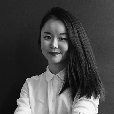
Minjoo Ham – Type Designer, Researcher & Educator
Minjoo Ham is a South Korean type designer, researcher and educator based in Berlin. Her work focuses on experimental approaches to Hangul type design, always blending multilingual, cultural and political perspectives.
She views type not as a neutral tool, but as a living, emotional and sometimes uncomfortable material – deeply tied to identity, language and movement. In her design practice, she often challenges Latin-centric standards and explores friction rather than harmony in multiscript typography.
Blazeface Hangul
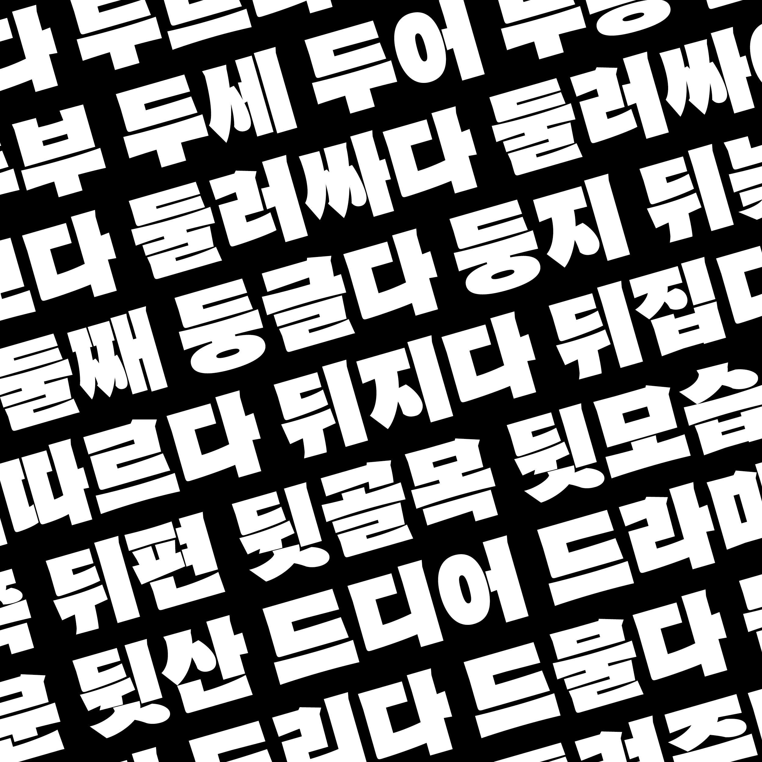
Blazeface Hangul – a hybrid reinterpretation of Latin and Hangul typographic logic
Blazeface Hangul is one of Minjoo’s boldest typefaces – a reinterpretation of the Latin font “Blazeface” by Blaze Type, extended into the Korean alphabet. The design embraces optical extremes and contrasts, rather than smoothing them out. It’s a statement on cultural tension and transformation through type.
Academic Background & Philosophy
Minjoo studied type design at the HfG Offenbach and holds a strong academic background in both Latin and Hangul typography. She teaches internationally and is active in discussions around non-Latin education and decolonial design thinking.
Her philosophy is rooted in sensitivity to form, language and identity. She encourages future designers to reflect on how visual systems shape the way we see, speak and exist in the world.
Paste-Up Workshop
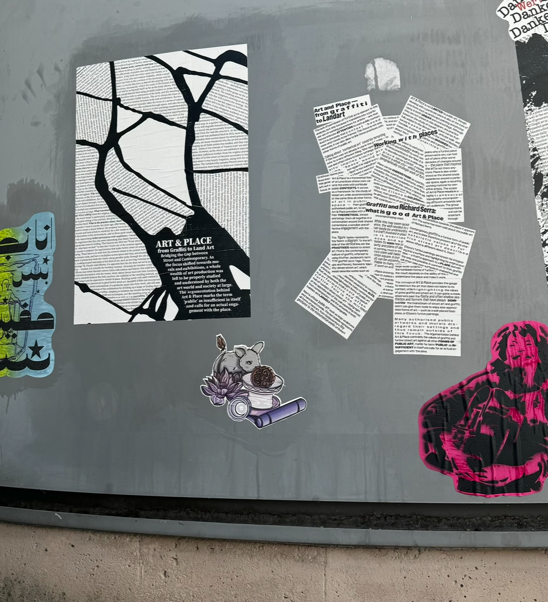
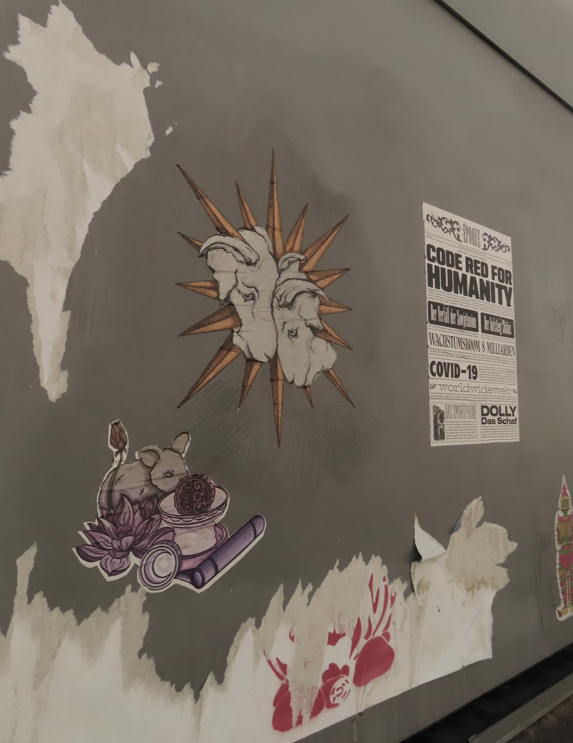
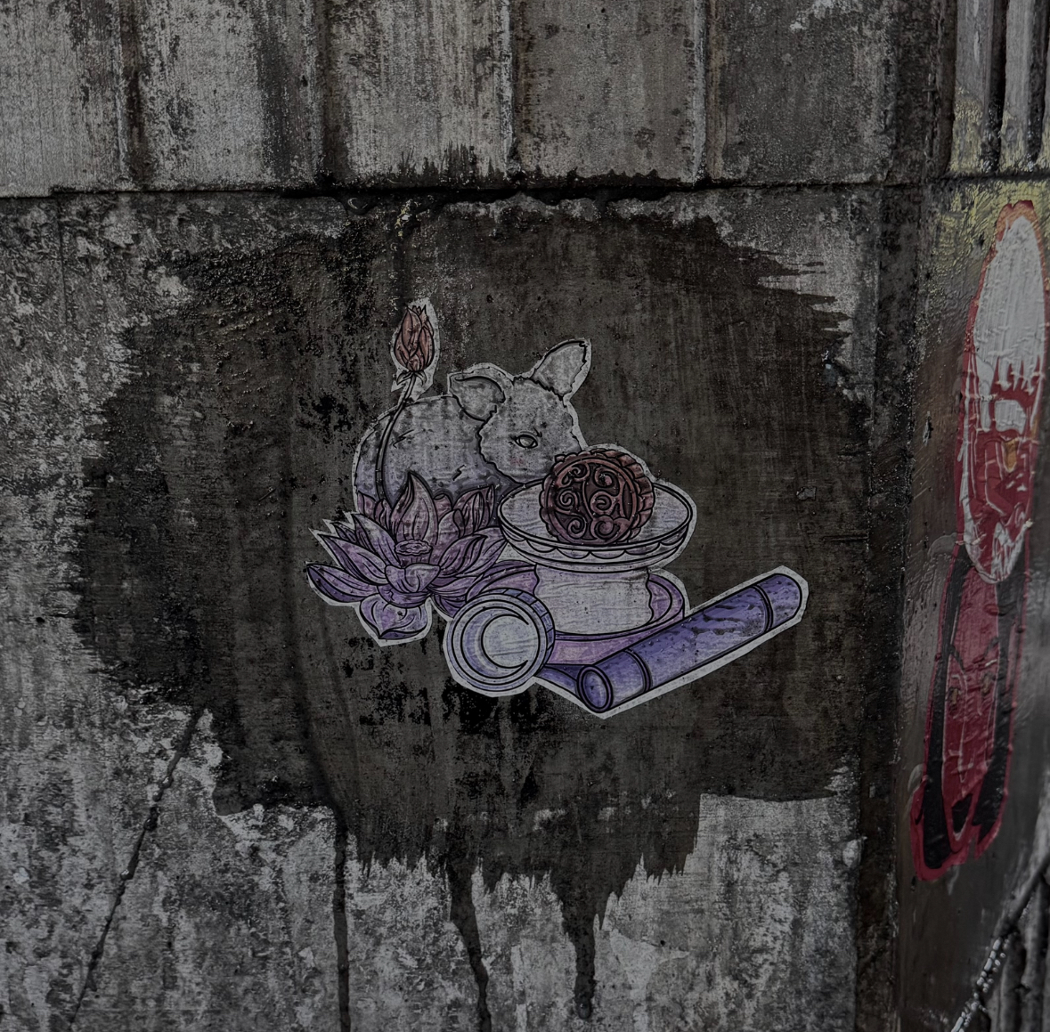
During the semester, I participated in a collaborative Paste-Up Workshop where we explored urban visual storytelling. We created temporary installations in public spaces using printed posters, personal illustrations, and handwritten messages.
The goal was to experiment with visibility in everyday urban environments – adding layers, hiding messages, or reclaiming visual space. I especially enjoyed how diverse the approaches were, ranging from poetic to political, minimal to maximal.
My Paste-Up Project: The Moon Rabbit
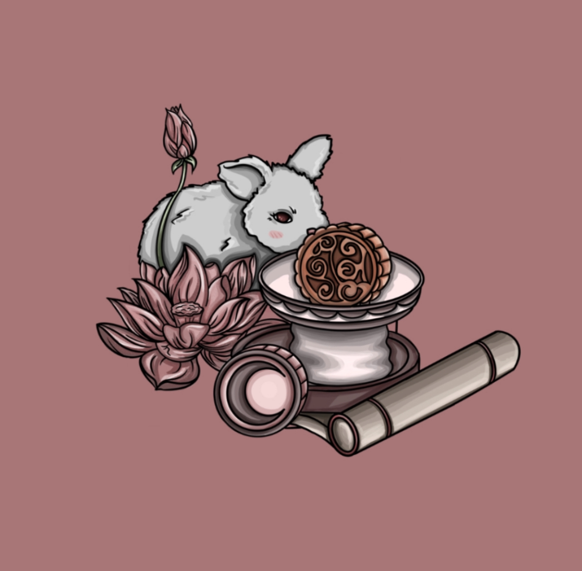
1. The Rabbit as Lunar Being
In many East Asian cultures (China, Korea, Japan), people don’t see a “man on the moon” but a rabbit, often depicted pounding rice cakes. This figure symbolizes care, healing and cyclical continuity.
2. The Mooncake
Central to Mid-Autumn Festivals like Chuseok or Tsukimi, the mooncake stands for abundance and gratitude. In my illustration, it rests on a pedestal – like a ritual offering.
3. The Lotus Blossom
The rabbit sits on an open lotus – a symbol of purity, rebirth, and blossoming despite adversity.
4. Scroll & Seal
These reference cultural preservation and tradition – symbolic inscriptions of female knowledge and experience.
Meaning: A quiet yet powerful image about care, visibility, and cyclical renewal. Small in size – large in symbolic weight.
Project Concept: Tengrism
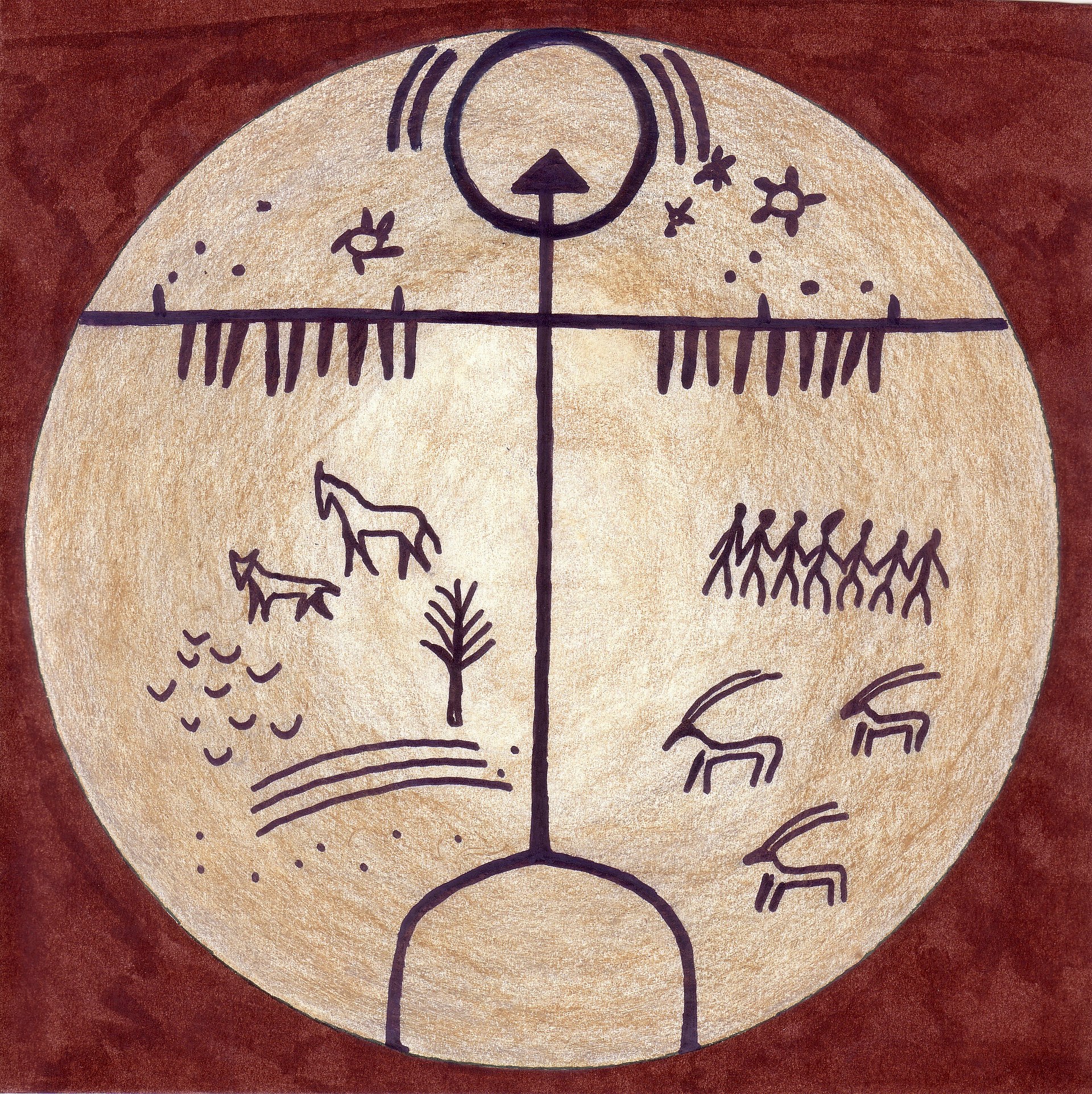
I’m currently developing a project on Tengrism – the ancient belief system of the Turkic nomads. I want to explore the mythological symbols, deities and spiritual narratives that have been lost or erased over time – and find a visual form to make them seen again.
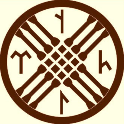
- Fabric Installation: “Spirit Scripts” – Transparent fabric printed with Göktürk runes and deities. Visibility shifts with light and movement.
- Typographic Objects: “Broken Language” – 3D fragmented letters that form words only from specific angles.
- Card Set: “Spirits of the Steppe” – Interactive cards revealing invisible content through light, heat, or rubbing.
To Do & Plans
- Finalize direction: Tengrism
- Material and moodboard research
- Continue typographic experiments
- Photographic documentation
- Design and print final publication
Thanks for visiting!